Virginia Considers a Bill to Allow Affordable Housing on Faith-Based Land

Writer’s note: this post was originally posted on my substack blog, Housing in Practice, on January 23rd.

This week, the Virginia state legislature is considering a bill, the Faith in Housing for the Commonwealth Act (SB 233), to allow affordable housing on land owned by religious organizations. If you live in Virginia and are so inclined, I strongly encourage you to email the Senate about your support for the bill. Here is an simple action alert from YIMBY Action that you can use for contact info and talking points. This Wednesday, January 24th, the bill will be heard by the Senate’s General Laws and Technology Committee.

It’s a bill that I really support (full disclosure: I work for a developer that has helped churches build housing), not just because of VA’s housing shortage, but also because of my experiences witnessing the transformative impact of these projects. In an era of falling religious attendance and aging facilities, many faith-based institutions must make difficult choices about how to remain financially solvent. Do they defer expensive maintenance costs that threaten the livability of their property? Or maybe do they move somewhere far away from the community they’ve called home for decades?

Fortunately, there’s an alternative solution that can allow churches to remain in place while raising the funds for new, modern spaces. And that solution is to redevelop their property with housing. By selling or leasing part of their land to a housing developer, churches can raise money to build a smaller, modernized space on the same site as their old facilities. This allows them to continue serving the local community that they’ve been rooted in for many years. It also serves the organization’s mission directly by using their land to build housing for those in need.

Sounds like a commonsense solution that should be an option for more religious institutions, right? So what are the barriers? Primarily local zoning rules, which oftentimes make it illegal to build housing on religiously-owned land. For one thing, this land is often in recreational or commercial zones which restrict any residential development. Moreover, faith-based institutions are often located in zones that prohibit residential density beyond that of a single-family home, which, if built, is typically not enough to raise the funds needed to build a new sanctuary. SB 233 would make it legal, statewide, for religious institutions to build subsidized affordable housing on their land up to 40 units/acre. And crucially, like a similar law recently passed in California (SB4), the bill makes residential uses legal no matter the local zoning says.

That’s great news, because churches throughout Northern Virginia are increasingly turning towards redevelopment with housing to address their financial needs. A few recent examples below show the transformative impact that’s possible when we legalize this type of development.

1. First Baptist Church of Clarendon – Arlington, VA

First Baptist Church of Clarendon before and after redevelopment. Images taken from Google Street View.

From 2010-2012, The First Baptist Church of Clarendon redeveloped their 1950s-era building with a new apartment building. The photos above show how the development preserved the steeple and façade of the church, and just how darn cool an apartment building looks integrated with an old church. The development added 46 market-rate apartments and 70 income-restricted affordable apartments, along with renovating an onsite childcare facility, a common tenant hosted by churches that is in desperately short supply in Arlington.

2. Arlington Presbyterian Church – Arlington, VA

Arlington Presbyterian Church before and after redevelopment. Images taken from Google Street View and the Arlington Partnership for Affordable Housing website.
New APC ground floor space and modern lobby. Images taken from the APC website and Faith and Leadership.

In 2019, the Arlington Presbyterian Church sold their land to a nonprofit developer to build a new income-restricted affordable apartment building with a ground floor space for a new sanctuary. Although the congregation had to say goodbye to their old church building, they gained a smaller, modern space that will sustain the congregation well into the future. In addition to building 173 income-restricted apartments, the new building included a retail space for a kitchen incubator space for low-income culinary students.

3. The Episcopal Church of Resurrection – Alexandria, VA

Episcopal Church of the Resurrection before and after redevelopment. Images taken from Google Street View and the architect, Cunningham & Quill.
The new Episcopal Church of the Resurrection sanctuary after redevelopment, outside (left) and inside (right). Images taken from Partners for Sacred Places website.

Also in 2019, the Episcopal Church of Resurrection redeveloped their aging building into a stunning new campus with housing. The new project made room for 113 income-restricted apartments alongside a separate sanctuary space connected by a beautifully-landscaped patio. The bright new sanctuary is a great example of how redevelopment of a church can enhance rather than detract from its aesthetics.

4. Central United Methodist Church (CUMC) – Arlington, VA

Central United Methodist Church before and after redevelopment. Image on the right is partially through construction. Images taken from Google Street View and the author.
Renderings of the new CUMC ground floor sanctuary entrance and reclaimed stain glass. Renderings from DCS Design.

This last example is dear to me because it’s a project that worked on for many years (I will make its own dedicated post soon). But also because it will soon open its doors in February, welcoming new residents and the CUMC back to a brand new sanctuary and childcare space. Located directly across from the Ballston Metro station in Arlington, this new building will include 144 income-restricted apartments along with a ground floor and second-floor space for CUMC and a new Kinhaven childcare center. Despite its location across the street from a metro station, this project spent hundreds of thousands of dollars rezoning from commercial to mixed-use to allow apartments. With new legislation like SB 233 to legalize residential uses on church land, money from rezoning could be better spent on better building amenities, reducing rents, or expanded childcare spaces.

A Call to Action

Perhaps the most notable thing about the projects above is that they don’t require any tax-payer subsidy other than the typical programs for subsidized affordable housing that already exist. If the state wants more housing like this, all it has to do is make them legal! If you live in Virginia and agree that projects like those above should be legal for all religious institutions, please speak up. Write to the VA Senate now to tell them that you support SB 233 and legalizing housing on religious-owned land across Virginia.

An Office to Residential Conversion (+ Vertical Addition!) in Silver Spring

I got the chance to tour a very cool office-to-residential conversion last week designed by Nelson Architects and built by GCS-SIGAL. The team is part way through converting this formerly nearly vacant office building into new housing. This isn’t just a typical conversion though — in addition to converting the existing office building to residential, the project is also adding a new 5-story vertical addition to the building.

Original Guardian Building from 2021 above versus under construction today below. In addition to the reuse of the original steel structure for first 6 floors of the building, you can see the new steel-framed structure being added for a 5-story vertical addition at the upper left of the photo.

With this new vertical addition, the project will add a total of 168 units of new housing in the heart of downtown Silver Spring, MD. Like many older office buildings in the DC market, the Guardian building, located at 8605 Cameron Street, was struggling to keep tenants, and so the owner decided to convert the 60s-era building to residential use along with ground floor retail.
I don’t have any information on the project costs or financials, but it was fascinating to get a closer look at how the construction process is unfolding. On the tour, I got to see a few key steps in the conversion firsthand. In layman’s terms (coming from someone who is not a construction or design professional), the basic steps I saw were:

  1. Building stripped down to its original steel framing, which will continue to serve as the main structure for the first 6 floors of the new mixed-use residential building. The reuse of the existing building structure also helps save costs and meet the project’s LEED certification.

    Steel framing of the Guardian Building.
  2. Reinforcements to the structural foundations in the basement, required for the new expected loads with the vertical addition to the building.

    Reinforced structural beam at the basement level.
  3. Replace slab-on-grade foundation in the basement. This old 1960s-era basement is not large enough to serve as new parking spaces but will host some bike parking as well as mechanical rooms.

    Dirt is all that’s left of the old basement floor. Later, the construction team will pour new concrete for the new basement floor.
  4. Cut the roof off and start adding new steel framing for the new upper floors! The photo on the right below shows an example where the new steel framing system meets the old steel framing to form one continuous building structure.  The photo on the left shows the progress to date on the new steel framing system, which will allow for 5 additional stories. For those interested, the new addition will use the Hambro steel framing system.

    New steel framing being added for a 5-story vertical addition.

One aspect of the project that was immediately noticeable was the conducive geometry of the Guardian Building. The long, rectangular, and relatively small floor plates seem well-suited for conversion to residential units. That’s because the building’s width, about 70’ across, works well for a single double-loaded corridor of units without the need for major carveouts for light and air access. As Emily Badger illustrated in this wonderful NY Times explainer on office-residential conversions, this is an important factor that often makes older office buildings the best candidates for conversions. The project will also not add any new parking spaces, which surely helps make the project work financially.

Example floor plan from the new Guardian Building conversion showing a single double-loaded corridor of apartments. The narrow rectangular shape of the building allows all units to receive light and air without the need for major coring through the old building. Photo available from the Montgomery County Planning Website.

Although the development community is quick to point out that conversions are hard and certainly won’t solve the housing crisis, it’s very cool to see such an ambitious conversion in practice. With millions of square feet of old office buildings and extra air space throughout the region, even if only a small portion convert or add vertical additions, that’s a lot of potential for infill development.

Thank you again to GCS-SIGAL and to Grimm & Parker Architecture for allowing me along for the tour! And Happy Holidays.

Queens Court: a Case Study in Growing Affordable Housing

This is the story of how 39 units of 1940s era housing became a modern 249-unit committed affordable apartment community in Rosslyn, a booming mixed-use district near the border with DC. In many ways, Queens Court represents the best of affordable housing development in Arlington County, one of the most prosperous localities in the DC metro area. Queens Court used many of the standard government financing programs typical of many modern US affordable housing ground up new construction projects.  But due to its prime location and integration into a neighborhood-wide plan for growth, it’s a notable example of how to sustainably build affordable housing in urban infill locations.

Project Origins

Original Queens Court site outlined in red viewed from overhead. Taken from APAH presentation to Arlington County Board on 02/25/2017.

Originally built in 1941 as naturally affordable housing for a growing population of government workers, Queens Court was a small garden-style building consisting of 1-bedroom and studio apartments in the western part of the Rosslyn neighborhood of Arlington. By the late 20th century, the aging building was one of the last naturally affordable apartments in Rosslyn. In 1995, a nonprofit affordable housing organization, the Arlington Partnership for Affordable Housing (APAH), bought the site for $1.9M (aided in part by Arlington County loan funds) and committed the apartments to affordable rents for the indefinite future. This purchase was nearly 8 times less than the assessed value two decades later, making this a great investment for both the nonprofit and Arlington County looking to multiply affordable housing in a competitive real estate market. By the 2010s, Rosslyn had become a booming neighborhood in the transit-rich Rosslyn-Ballston corridor in Arlington, the primary area of Arlington’s growth for much of the past 50 years. With its prime location with easy access to Washington, DC and dozens of walkable transit connections, it made sense to redevelop the site into more affordable housing for a growing population.

The original Queens Court as it appeared from 1941-2019. Taken from APAH presentation to Arlington County Board on 02/25/2017.

Rezoning for Growth

From the perspective of an affordable housing developer, any redevelopment would require relocating the existing tenants of the building. This is a sensitive and expensive undertaking that is only worthwhile if zoning allows for enough additional housing to justify the hardships. Unfortunately, the site’s RA6-15 zoning designation only allowed for marginal increased density, and so a rezoning was needed. Thankfully, there was a willing and supportive local government. Arlington took a holistic planning approach to not only rezoning the Queens Court site, but also the surrounding neighborhood in a plan known as the Western Area Rosslyn Plan (WRAP).

2015 Western Rosslyn Area Plan overview. Taken from APAH presentation to Arlington County Board on 02/25/2017 and notated by the author.

This plan was a neighborhood-wide plan for growth aimed at allowing new private development while at the same time upgrading public facilities in the area with a new expanded fire station, school, and park. The final plan also included over 800 units of new market rate housing, and, what is now a new CVS and Foxtrot grocery. The replanning process lasted from June 2014-July 2015, consisting of a dozen or so community meetings followed by a County Board vote focused on not whether, but how to plan for growth. It’s a great example of how city planning, when directed towards upgrading public facilities to accommodate growth rather than preserving community character, can be a catalyst for positive neighborhood transformation. After the passage of the plan, Queens Court went through another 1 ½ year site-specific zoning change to allow up to 12 stories and 6.0 FAR on the site. In exchange, the county pushed to have a portion of the Queens Court site (about 9,000 square feet in total) dedicated as a publicly-accessible playground for new community park.

Rosslyn Highlands Park playground in front of the new Queens Court apartments. Taken from Arlington County website.

Design and Unit Mix

The building footprint was designed to wrap around the new playground in the southeastern corner of the site, featuring double-loaded corridors with lots of community spaces on the ground and 12th floors. The unit mix intentionally features many 2 and 3-bedroom units to house more families, which also helped the project score well for local and state subsidized funding. The units are mostly all income and rent restricted at 60% of the area median income (AMI) to qualify for low-income housing tax credit (LIHTC) financing. There are two levels of parking in total with a 0.6 parking ratio as well as 100 bike parking spaces in the garage level.

Queens Court first floor plan, showing space for a county park in the southeastern corner. Taken from APAH presentation to Arlington County Board on 02/25/2017.
12th floor plan with community room. Taken from APAH presentation to Arlington County Board on 02/25/2017.
Queens Court unit and income mix. Taken from APAH website.

Financing and Construction

The total development costs for the project totaled $415,755/unit, although this includes the land acquisition price ($62,008/unit), which was reinvested by the developer (who previously owned the land) into the project as a sponsor loan. Netting out this acquisition price, the true total development costs decreases to about $353,747/unit, well below the costs of similarly sized multifamily projects in today’s metro DC market. This is a credit to the foresight of purchasing this land at a discount 20 years earlier.

The structure of the building was built with concrete (Type 1A) with brick and fiber cement cladding. The public park lies on top of the concrete parking garage, and build-out of the park itself was managed separately by the county.

To pay for these costs, Queens Court used a combination of commercial loans ($28M), low-income housing tax credit equity (LIHTC), and low-interest Arlington County loan funds, a standard combination of sources for subsidized committed affordable housing projects.

Queens Court Redevelopment Sources and Uses

Internal sources based on APAH 8609 Application to Virginia Housing.
Queens Court construction photos 2019-2021. The completed building is in the lower right corner. Photos taken from KCM construction management reports.

As part of the site’s rezoning, Arlington County also required extensive infrastructure upgrades around the site. Most of these requirements (known as site plan 4.1 regulations per the administrative code section) are standard for any multifamily projects that seek zoning changes. These are generally positive investments that help improve the site infrastructure, but they are also expensive requirements that added several hundred thousand dollars’ worth of cost to the project.

Notable infrastructure improvements required at Queens Court. Taken from Arlington Site Plan #444.

Final Thoughts

Overall, Queens Court highlights many of the best parts of the county’s commitment to growing housing and infrastructure in its transit corridors. By focusing staff resources on targeted public investments to accommodate new housing, Arlington was able to welcome more than 200 new moderate income residents into a revitalized western Rosslyn neighborhood. And with its long-running affordable housing loan program, the county was also able to work with a developer to purchase this prime site in the mid-90s for nearly 8 times less than what it was worth two decades later. This set up the project well for a cost-effective redevelopment when the area boomed two decades later.

Queens Court Full Development Timeline. Image by the author.

Tour de Shaw

Chers amis,

Je me suis inspiré du blogue Mes Quartiers, par Gilles Beaudry, de faire cet article. Ce blogue fait des tours à pied des quartiers de Montréal et j’apprécie surtout son adoration vers les sites locaux. Après avoir suivi Mes Quartiers avec admiration, j’ai décidé de faire la même chose pour un quartier de Washington. J’espère que les gens locaux peuvent apprendre un peu plus sur Washington ou que celles et ceux qui ne peuvent pas voyager en cette période de la pandémie peuvent s’amuser bien avec ce tour.

Bienvenue à Shaw !

Au début du XIXème siècle, ce qui est maintenant Shaw était principalement une zone rurale. Le lieu est vite devenu un lieu d’accueil pour les immigrés ouvriers européens et enfin un quartier afro-américain au cours du XXème siècle. Aujourd’hui le quartier accueille de plus en plus de jeunes étudiants sortant des universités, qui lui donne une véritable mixité démographique et économique. Ce changement démographique a rendu Shaw l’un des quartiers les plus dynamiques de Washington, mais vous pouvez encore constater les traces de son histoire profonde. Shaw est peut-être mieux connu pour son rôle important dans l’histoire afro-américain, surtout comme un berceau pour le mouvement des droits civiques. Si vous voulez un résumé sur l’histoire du quartier, vous pouvez trouver ici un tour nommé  « Shaw Heritage Trail » par l’office de tourisme de la ville. Cette visite m’a beaucoup fasciné sur l’histoire de Shaw et son héritage culturel dans l’histoire des États-Unis.

Quant à moi, je vous propose aussi une balade historique avec quelques d’autres sites de ce quartier aux racines afro-américaines à Washington. Sur la route, nous croiserons des hommes et des femmes illustres, les restaurants et bars à cocktails artisanaux, et des architectures et partagerons mes favoris coins du quartier.

C’est parti !

Voici la carte du tour (et la télécharger ici):

Carte du tour

1. Parc de Samuel Gompers

Vous pouvez arriver soit par la station de métro Mt. Vernon Sq/7th St-Convention Center (lignes jaunes et vertes) à l’intersection des rues 7ème et M, soit par le bus 64 qui arrête à l’intersection de la rue 11ème et L.

Le premier arrêt (à la rue 10ème et la rue L) commence avec le parc triangulaire nommé après le chef syndicaliste américain Samuel Gompers. Gompers, représenté assis en bronze au milieu du parc, était le chef majeur de la célèbre Fédération américaine du travail.

Le seul parc autour, vous pouvez rencontrer plein de gens promenant leurs chiens. Ce parc est aussi remarquable parce qu’il démarque la limite entre le centre ville au sud, avec ses grands immeubles de bureaux et bâtiments gouvernementaux, et les quartiers plus résidentiels au nord. J’imagine souvent que la statue en bronze a été pointée vers le sud afin que Gompers, chef des ouvriers, puisse faire face aux monuments de pouvoir politiques sur le National Mall.

Statue de Samuel Gompers
Parc de Samuel Gompers

Sortez du parc vers le nord-est. Prenez la rue 10ème vers le nord jusqu’à milieu entre la rue L et M, puis tournez à droite.

2. Parc de la rue 10ème

Voici un magnifique coin de verdure entre deux grands immeubles. Le parc soi-même n’est rien de spécial mais il est un bon endroit pour s’isoler de la ville de temps en temps. Le parc est entouré de bâtiments de différentes époques, ce qui le donne du charme. Ne manquez pas les paroles inspirantes de Margaret Mead ou Martin Luther King écrites sur la dalle et des bancs. Je trouve ce lieu parfait pour un petit café entre amis ou du temps de réflexion tout seul.

Parc de la rue 10ème entouré des grands bâtiments


Banc avec des mots inspirants de Margaret Mead

Continuez au nord sur la rue 10ème après le croisement avec la rue M. Puis, tournez à droite dans la première ruelle ci-dessous.

L’entrée de la ruelle de Blagden sur la rue 10ème

3. Blagden Alley (Ruelle de Blagden)

Voici l’une des ruelles les plus connues à Washington, qui s’est d’abord développée à partir des ouvriers afro-américains qui y ont installé les bidonvilles dans le XIXème siècle. Quelques-uns des bâtiments de cette époque ont été convertis en bureaux, restaurants, et bars. Les maisons à l’extérieur de la ruelle étaient aussi des résidences luxueuses pour l’élite, y compris la maison de Blanch K. Bruce (909 M Street), le premier afro-américain à servir jusqu’au terme de son mandat au Sénat.

Vous remarquerez tout de suite partout des fresques murales, qui appartient au DC Alley Museum. Grâce à une subvention du gouvernement de Washington, toutes ces œuvres viennent des artistes locaux. Voici ma préférée ci-dessous, un hommage au célèbre John Thompson, qui était entraîneur de basket à l’université de Georgetown. Il a mené son équipe à la victoire lors d’un championnat national, le premier coach afro-américain à accomplir le fait.

Le fameux John Thompson Jr., ancien coach de basket à l’université de Georgetown. Peint par Billy Colbert.
“Love”, par Lisa Thalhammer, partie du DC Alley Museum

Aujourd’hui, vous pouvez découvrir des bons restaurants et bars qui se trouvent dans des anciens bâtiments. Prenez un repas rustique au restaurant américain  The Dabney  ou un dépaysement au Tiger Fork. En été, la terrasse du bar Calico est très prisée par les jeunes. Vous pouvez aussi prendre un café à La colombe.

La porte du restaurant “The Dabney”, décerné une étoile Michelin en 2017.
Sortie de la ruelle de Blagden avec la porte du café La Colombe à côté

Prenez le chemin nord en passant la Colombe, sortez de la ruelle et tournez à droite. Une fois sur la rue 9ème, tournez à gauche vers le nord. 

4. Shiloh Baptist Church (L’église baptiste Shiloh), Carter G Woodson House, et 817 Q Street

Tout le long de la rue 9ème, vous trouverez des places commerciales, y compris plusieurs restaurants éthiopiens. La région de Washington, et surtout le quartier de Shaw, est devenu un endroit migratoire pour les éthiopiens dans les années 1980. Je trouve l’ambiance de ces restaurants, qui sont souvent à la base des vieilles maisons du XIXème siècle, très chaleureuse et accueillante.

Restaurant éthiopien Chercher sur la rue 9ème

En plus des restaurants, il y a trois sites dans cette partie du quartier qui peuvent vous faire ressentir l’histoire profonde de ce lieu. Le premier est au coin des rues 9ème et P, où se trouve l’une des plus célèbres églises de Washington, Shiloh Baptist Church. Fondée par les esclaves libérés pendant la guerre civile, cette église était le site de rassemblement pendant le mouvement pour les droits civiques dans les années 1960. Martin Luther King Jr. y a même donné un discours en 1960.

Église baptiste Shiloh sur la rue 9ème

Juste en face de cette église de l’autre côté de la rue 9ème se trouve Chaplin’s, un restaurant qui sert la soupe ramen et des cocktails dans un décor à l’effigie de Charlie Chaplin.

Restaurant de la soupe ramen Chaplin’s

Un peu plus loin à gauche se trouve la maison de Carter G. Woodson, le célèbre historien et le deuxième homme afro-américain à obtenir un doctorat de l’université d’Harvard. Souvent connu comme le « père de l’histoire afro-américaine », il a passé la plupart de sa carrière dans cette maison, où il a publié plusieurs grands journaux d’histoire de la communauté afro-américaine. C’est ici qu’en 1926, il a fondé ce qui allait devenir le mois de l’histoire afro-américaine, aujourd’hui célébré en février aux États-Unis. La maison victorienne est gérée par le service national des parcs et ouverte au public le jeudi, le vendredi, et le samedi.

La maison de Carter Woodson

Tournez à droite pour rejoindre la rue Q en direction de l’ouest. 

Vous pouvez trouver une autre remarquable maison victorienne à 817 Q Street. Entre 1943 et 1978, ce lieu a servi comme le bureau de la Fraternité Internationale des porteurs de wagons-lits, un grand syndicat pour les ouvriers afro-américains travaillant sur les chemins de fer. Le fondateur de ce syndicat, A. Philip Randolph, a aussi utilisé cette maison pour organiser la marche sur Washington en 1963, où Martin Luther King a donné son célèbre discours “I have a dream”.

Maison de 817 Q Street, où s’est passé beaucoup de planifications de la marche sur Washington

Mettant l’histoire de côté pour un moment, je trouve ce lézard sur le mur de la maison tellement curieux !

Continuez sur la rue Q jusqu’à la rue 7ème, puis tournez à gauche.

5. La rue 7ème

L’autre grande avenue commerciale du quartier, la rue 7ème vous présente de nombreux sites à noter. À partir de l’intersection des rues 7ème et Q, je vous encourage à découvrir les plats savoureux de la Jambe, un restaurant français offrant du bon fromage, du jambon et du vin.

Vous avez envie d’une bière allemande, traversez la rue Q pour arriver à la jardinière de bière Dacha Beer Garden, un endroit populaire auprès des jeunes après avoir quitté le bureau. Et bien sûr dans cette partie de Washington vous n’êtes jamais loin d’un restaurant éthiopien.

Dacha Beer Garden avec sa grande peinture murale de l’actrice Elizabeth Taylor
Porte de La Jambe, restaurant français.
Restaurant éthiopien Lalibela sur la rue 7ème

Tournez vers le nord sur la rue 7ème et arrêtez-vous à l’intersection de l’avenue de Rhode Island et la rue 7ème. Voici le bâtiment qui a donné le nom “Shaw” aux environs. Ce grand immeuble a été construit comme le lycée “McKinley Technical High School” en 1902, puis renommé “Shaw Junior High School” après le colonel Robert Gould Shaw de la guerre civile, pendant les années 1920. Entre 1928 et la fin de la ségrégation raciale, l’école a été désignée pour les afro-américains du quartier, qui a été converti en logement social pour les personnes âgées et attire toujours l’attention avec sa grandeur et ses arches romanesques.

Ancien immeuble du lycée Shaw Junior High School

En regardant l’autre côté de l’avenue Rhode Island, le style moderne de la bibliothèque publique contraste fortement avec le style plus classique de l’ancien lycée de Shaw. Les diverses architectures du quartier me fascinent toujours. Vous verrez bientôt un autre exemple d’architecture frappante plus loin sur la rue 7ème.

Bibliothèque publique de Shaw

Traversez l’avenue de Rhode Island, puis, tournez le visage à droite entre les rues R et S. 

Un peu plus loin vers le nord se trouve une église de “United House of Prayer for All People” (Maison unie de prière pour tous), une secte chrétienne très populaire dans la région de Washington. Cette grande église m’a tourné la tête avec sa pyramide et son dôme bleu, les lions devant la porte, et les anges qui surplombent l’entrée. Tous ces choix audacieux sont représentatifs de l’esprit vif de cette église, connue pour ses parades musicales et baptêmes dans la rue.

Église d’United House of Prayer sur la rue 7ème

Continuez vers le nord sur la rue 7ème. 

6. Le théâtre Howard et les médailles du chemin de la gloire

En continuant sur le côté droit de la rue 7ème, vous remarquerez  sur le trottoir des médailles. Ceux-ci rendent hommage aux célèbres chanteurs dans l’histoire des États-Unis, notamment celle de Washington, qui se sont produits dans le théâtre Howard à l’horizon.

En tournant à droite dans la rue T, le théâtre Howard marque le dernier arrêt du tour qui date de 1910. C’est ici où des grands noms du jazz comme Ella Fitzgerald, Billy Eckstine, ou Duke Ellington se sont produits, ainsi que Chuck Brown, fondateur du courant musical washingtonien Go-Go. Aujourd’hui, le théâtre accueille toutes sortes de concerts et autres événements. On peut espérer pour une fin vite de la pandémie pour un tel théâtre. Trouvez le programme ici.

Théâtre Howard

En retraçant votre chemin, vous pouvez même trouver une peinture murale du chanteur Marvin Gaye à l’intersection des rues 7ème et S. Marvin Gaye a grandi à Washington et a joué au théâtre Howard dans sa jeunesse.

Peinture murale du chanteur Marvin Gaye aux rues 7ème et S.

En fin de journée, tout proche du théâtre, vous pouvez trouver une bonne bière locale pour se détendre chez Right Proper Brewing Company. Cette brasserie a beaucoup de places en terrasse pour s’assoir et profiter de l’ambiance.

Brasserie locale Right Proper Brewing Company. Ils ont beaucoup de places en terrasse en temps de pandémie.

Ainsi s’achève cette visite de Shaw ! J’espère que cela vous a plu et vous a donné l’envie de venir au quartier. Enfin, pour revenir sur vos pas, vous pouvez prendre la rue 7ème et rejoindre la station de métro Shaw-Howard Univ (lignes vertes et jaunes).

À bientôt !

P.S. Lors du retour, ne manquez pas la rue colorée qui est près du théâtre Howard. Les couleurs me fascinent !

Rue colorée près du théâtre Howard

My Dream Land Use Reform Package

In the spirit of documenting some of my coursework on this blog, I thought I’d share one of my favorite assignments from this past semester. In my recent U.S. Housing Policy course with former FHA head Carol Galante, we were tasked with developing a mock set of 5 recommendations for addressing the housing affordability crisis through land use reform in the Bay Area. The assignment got me fantasizing a lot about my top 5 policies—no matter how politically feasible. Below, I present three local policies, one state, and one federal policy that are my top 5 land use reform policies for housing affordability. Obviously there are some other high-level reforms (e.g. providing housing as a human right) that I could include here, but sticking with the theme of land use reform is more in my wheelhouse and a more manageable set of possible reforms.

Local Recommendations

At the local level, the rules of the housing development process are largely set in stone by state level policies. However, localities in the Bay Area often make the process more difficult and costly than even state policies demand. Therefore, two of my fantasy local policy recommendations represent common sense reforms (at least among city planners) to make development easier and less costly. The third local reform—land value taxation—is a progressive tax to redistribute the wealth from well-endowed landowners to the general public, who create the social value of the land.

I. More Ministerial Development Approval

For many localities in the Bay Area, the general parameters of the city planning process are largely prescribed by the state. For example, localities must make general plans where they plan which areas of the city can receive future housing growth and zoning decisions must conform to these plans. Furthermore, each locality must review the environmental impacts of housing developments to ensure that they comply with the California Environmental Quality Act (CEQA). This process is already quite extensive and onerous as is. Yet, many localities in the Bay Area make this process even more burdensome by not allowing ministerial approval—that is, approval that is dependent on the judgment of a planning commission—for housing that meets the zoning code, general plan, and environmental standards. Instead, cities like San Francisco mandate discretionary review for nearly every housing development, no matter how small. In Berkeley, neighbors have even appealed a 3-unit development to the city’s Board of Supervisors, who rejected the project even though it met the zoning code.

The state’s Housing Accountability Act prevents cities from rejecting housing developments that do not meet the zoning code. However, many cities enact zoning policies that automatically trigger discretionary review. For example, San Francisco has many zones that automatically trigger “conditional use authorization”, in which the Planning Commission only approves the project if they judge that it “is necessary or desirable to the neighborhood” (SF Planning Department 2017).

This extra planning results in extensive and costly planning review processes for small housing additions or mid-sized apartment buildings that are often more affordable than larger high-rise apartments. Instead, it makes more sense to me to focus limited discretionary planning resources on large apartments that have the biggest impact on the surrounding environment. For whatever limited impacts small to mid-sized developments have on the surrounding neighborhood, it is easy to legislate these into the planning and zoning code. After all, what’s the point of having zoning regulations on paper if we have to individually review every housing development anyway?

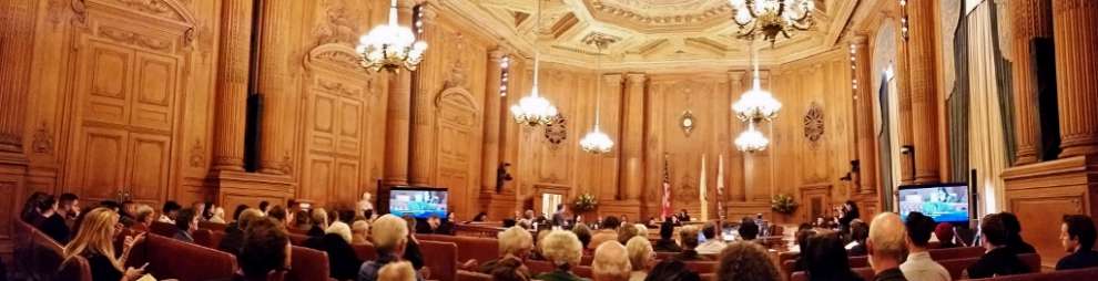
Public hearings—like this one in San Francisco—are overused and oftentimes a death knell for housing developments. Image taken from: http://www.sfpublicgolf.org/news.php?news_id=1746

Therefore, my first dream policy is to mandate ministerial development approval for small to mid-sized housing projects that meet the zoning code. This simple procedural change could dramatically reduce entitlement costs for developers, increasing housing supply and affordability region wide. In particular, small to mid-sized developments that cost less to build than large apartment buildings could also increase affordability for low to middle income residents.

As always, there would surely be some political pushback for this change. Neighborhood activists often use discretionary review to bring developers to the table to negotiate for community benefits packages. However, these concerns should be limited by the fact that discretionary review would still exist for large projects. In addition to this, some neighbors will dislike losing local control over development decisions. There is no easy solution to this political opposition—emboldened by overly generous planning policies for local residents to begin with. For this reason, it is critical that the state, regional governments, and executive branches of city governments, which are accountable to broader constituencies rather than local neighborhood coalitions, lead the fight for such policies. We’ve already seen some good news on this front in the Bay Area—from Sacramento (e.g. SB 35) to ABAG to aggressive housing production goals by the mayors of the three big Bay Area cities

II. Reduced Parking Requirements

Parking is expensive, costing tens of thousands of dollars and a significant percentage of the cost of constructing a unit of housing. This is especially problematic throughout the Bay Area, where many opportunities for growth are in infill locations where developers must dig underground or build higher to include parking. Yet cities throughout the region still often force developers to build more parking than what the market demands through outdated planning codes that include minimum parking-to-unit ratios.

Moreover, car ownership in the largest cities in the Bay Area, particularly San Francisco, have been declining recently. A recent survey of 80 housing developments through the Bay Area and found that 28% of the parking—adding up to nearly $200 million in costs—went unused (Tranform 2017). These trends suggest that the region can dramatically reduce the cost of housing while at the same time sufficiently meeting parking demand by simply not mandating that developers build parking. Some of the bigger cities in the region—notably San Francisco and Oakland—have already lowered parking minimums around transit. However, there is a lot of room for more reductions, particularly around BART stations in other Bay Area cities, such as downtown Berkeley or Redwood City, both of which have at least one-to-one unit to parking space ratios.

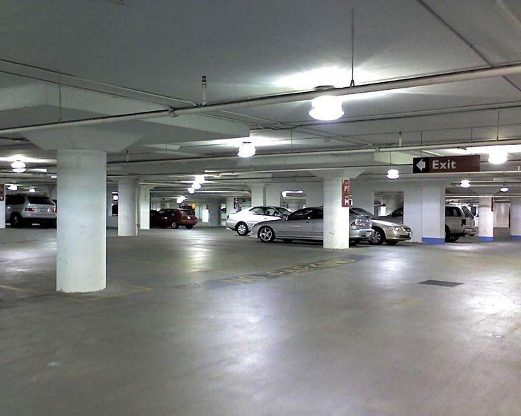
Despite local regulations that mandate parking minimums, many underground parking garages in Bay Area apartments look like this today. Image taken from: https://www.pinterest.com/boelsander/light-design-parkings/

In general, this reform seems to be less politically challenging than ministerial housing approvals, which are a much more radical departure from CA planning norms. In fact, some recent developments in San Francisco have faced opposition from progressive neighborhood groups because parking ratios have been too high. Despite the political momentum behind this reform, there is sure to be some local opposition from neighbors worried about increased neighborhood parking competition. However, if parking competition is fierce enough, there would also be private incentives for developers to build parking with housing, dulling the increased demand.

III. Increased Renter Protections Through a Land Tax

The two reforms above represent a return to free market principles, which can increase regional housing affordability by responding to market demand. However, the free market can also negatively impact existing renters, especially when prices increase dramatically in the short term due to high demand. Therefore, many CA cities must invest in renter protections to protect existing low-income residents. Aside from a moral justification for protecting residents from displacement, we can justify anti-displacement policies in that society values socioeconomic diversity and housing stability as a public good, worthy of government protection. Typically, the best way to provide public goods is for the government to subsidize this good.

Although the government can use any funds to subsidize renter protections, I propose that they tie these funds to the social value of land through a land value tax. Based on the writings of Henry George, a land value tax is levied on the socially created value of land, separate from the value that the owner contributed to the land. As demand increases to live in the Bay Area, the socially created value of the land increases—through no effort of the existing landowners. In this case, it’s necessary to tax the landowners in order to extract that social value and give it back to the public. In this case, I suggest using the funds to mitigate one of the largest negative effects of this growth—displacement of existing residents. For example, these funds could be used to fund existing renter’s protection enforcement, affordable housing acquisition, or rental assistance programs.


Land value enlarged by increases in the social value of land. Should be taxed! Image taken from: http://www.henrygeorge.org/rem4.htm

Out of the three local policy recommendations, this is probably the most politically difficult. Landowners would likely be vehemently opposed to any tax increases. However, there is a good argument this is a small compensation to pay after years of benefiting from artificially capped property taxes through Proposition 13. Furthermore, tying the funds to affordable housing and anti-displacement programs would likely be politically popular among liberal constituencies, particularly renters.

IV. State Recommendation: Common Sense CEQA Reform

Localities largely have to play by the state’s rules in planning and zoning decisions. One of the most restrictive and problematic of those rules is the California Environmental Quality Act (CEQA). A by-product of a wave of environmentalism in the 1960s and 70s, CEQA was initially passed with the intent to publicize the environmental impacts of a development and to consider mitigations for negative environmental effects (Fulton and Shigley 2012, p. 180). However, the law gives extraordinary power to opponents of development by allowing anyone to file a lawsuit for any reason, and placing the burden of proof on local governments. This has resulted in decades of CEQA abuse—lawsuits filed by neighbors or labor unions concerned not with environmental impacts but rather with protecting property values or securing union contracts.

In fact, in a review of all CEQA lawsuits filed from 2010-2012, Jennifer Hernandez has found that 2/3 of the housing-related CEQA lawsuits target environmentally friendly infill housing in urban areas (Hernandez, et. al. 2015, p. 63). Once a lawsuit is filed, it can take months or years for a court to reach a decision, during which time the project is stalled. Not only does this time delay supply increases from responding to the market, but it also increases the costs of development so that the project may become infeasible.

Fortunately, there are a number of common sense reforms—summarized well in Jennifer Hernandez’s study—to CEQA litigation that could make a big impact. First, CEQA litigants are able to conceal their identities and reasons for suing a development (Hernandez, et. al. 2015, p. 78). Requiring that litigants both identify themselves and the environmental reason for suing a development would represent an easy change to protect CEQA from non-environmental related abuses. Furthermore, projects can be sued an unlimited amount of times even after a court has upheld the project against previous challenges. Restricting lawsuits after a court has ruled that a project meets CEQA would go a long way towards curtailing abuses. Lastly, many courts that rule in favor of litigants deny housing projects entirely rather than requiring further environmental mitigation or public disclosure, even if the project meets the vast majority of environmental standards. CEQA litigation reform that would allow for more mitigation relief rather than vacating a project altogether would go a long way toward curtailing abuse by litigants that merely want to halt projects for non-environmental reasons. Overall, curbing these abuses would restrict CEQA lawsuits to those truly concerned with environmental impacts, helping lower costs for developing housing statewide and, in particular, in urban areas.

Although these CEQA reform measures make sense, a lot of entrenched interest groups—especially wealthy homeowners and labor unions—rely on abusive litigation to fight against development. The rules surrounding CEQA litigation have been in place for decades and reform disrupting this status quo would surely cause political backlash. However, appealing to the common sense nature of these reforms and targeting abuses of CEQA rather than legitimately environment-related lawsuits could help overcome political opposition. Furthermore, a growing awareness of CEQA abuse is sprouting up among the state’s progressive politicians, supported by pro-development yimbys (“yes in my backyard”).

V. Federal Recommendation: Funding Incentives for Land Use Reform

Lack of housing supply is a large issue in most of the high demand markets nationwide. This lack of supply is, in turn, a result of state and local land use control, where already-existing residents have the private incentive—and the political control—to block additional development. At the beginning of the 20th century, states and localities devised land use controls as a result of power delegated by the federal government. To be more specific, local control over land use is founded on the basis of police power, or the state’s power to regulate to protect the “health, safety, morals, and general welfare” of its inhabitants. This power is given to localities from states, who have this authority on the basis of the 10th amendment, which reserves all government powers not specified for the federal government by the Constitution to the states.

So if land use control authority is local, what can the federal government do? Its role is mainly limited to promoting states to “do the right thin” through example legislation and federal grants. In fact, the Obama administration did just that by proposing $300 million in funding through the Local Housing Policy Grants to regions that supported new zoning and land use regulations to create and expanded, more diverse housing supply (Furman 2015). These were grants proposed to localities to support any new policy—from infrastructure expansion to code writing assistance and implementation—that would reform land use policies to promote development. Although the total amount was a rounding error in the overall federal housing spending, it represents a small but significant step in the right direction. A few million dollars to hire a team dedicated to land use reform might be all a locality needs to make sweeping changes to build more multifamily housing in previously exclusive single-family areas or decrease parking requirements near transit-oriented neighborhoods. In this way, small incentives from the federal government could be enormously impactful to affordability. After all, it was the federal government’s model Standard State Zoning Enabling Act (1922) that contributed to the widespread adoption of restrictive zoning in the first place.

Federal support for land use reform could encounter opposition from Republican members of Congress that are generally less supportive of housing funding. However, the opposition is not guaranteed. This policy would represent a largely market-based approach to housing affordability and barriers to economic growth, which is likely appealing to conservatives.

References

Bialick, Aaron. 2014. “Car-Free Households Are Booming in San Francisco.” Streetsblog San Francisco (blog). August 16, 2014. https://sf.streetsblog.org/2014/08/15/car-free-households-are-booming-in-san-francisco/.

“Conditional Use Authorization.” 2017. San Francisco Planning Department. http://sf-planning.org/sites/default/files/FileCenter/Documents/481-CU%20Application.pdf.

Dineen, J. K. 2016. “In a Wealthy SF Neighborhood, Residents Fight Low-Income Housing.” San Francisco Chronicle. November 16, 2016. http://www.sfchronicle.com/bayarea/article/In-a-wealthy-SF-neighborhood-residents-fight-10617213.php.

Fulton, William, and Paul Shigley. 2012. Guide to California Planning. 4th ed. Solano Press Books.

Furman, Jason. 2015. “Barriers to Shared Growth: The Case of Land Use Regulation and Economic Rents.” The Urban Institute.

Hernandez, Jennifer, David Friedman, and Stephanie DeHerrera. 2015. “In the Name of the Environment.” Holland & Knight, August. https://www.hklaw.com/publications/in-the-name-of-the-environment-litigation-abuse-under-ceqa-august-2015/.

Li, Roland. n.d. “As Millennials Reject Car Ownership, Developers Reduce Parking in Projects – San Francisco Business Times.” Accessed November 8, 2017. https://www.bizjournals.com/sanfrancisco/news/2017/07/27/parking-crashes-against-reality-cre-q3-2017.html.

Taylor, Tracey. 2017. “Berkeley’s Bid to Stop New Housing Being Built Overruled by Judge.” Berkeleyside (blog). July 25, 2017. http://www.berkeleyside.com/2017/07/25/berkeleys-bid-stop-new-housing-built-overruled-judge/.

Transform. 2017. “Comparison Report | GreenTRIP Parking Database.” 2017. http://database.greentrip.org/.

How Long do Housing Developments Take in San Francisco?

This blog post is a shortened version of a longer academic paper. You can find the latest draft of the full paper here.

I. Introduction

Housing developments in San Francisco often endure long and dramatic battles between the public, developers, and the city itself. Yet, for all of the discussion around these battles, there does not exist any comprehensive accounting of just how long the housing development process is. This information is critical for either policy makers considering how to better streamline development review or developers considering the feasibility of a certain site. In this post, I’d like to introduce some preliminary data exploration on development times in San Francisco. Specifically, I have estimated the time it has taken housing developments completed in the recent past (mid 2009 to the first quarter of 2017) to reach completion after submitting their planning or building permit applications.

In order to do this, I appended quarterly datasets known as the development pipeline reports from the San Francisco Planning Department. These datasets are meant to be cross-sectional, but contain other helpful information such as the date a project was first filed. With this information, I transformed the multiple pipeline datasets into one project-level dataset of development timelines in the recent past. In this process, I had to make a few assumptions about development timelines—notably, I assume that a project is completed on the first date of the quarter when it “disappears” (i.e. is not present in) from the pipeline reports after being under a status of “construction” in the previous report. This means that the completion date is accurate within 3 months of the actual completion date. Note that these estimates also only measure the time from official application submission to completion, so do not take into account any preliminary review time, such as preliminary project proposals or community meetings prior to their official application.

Without further ado, I’d like to give a broad overview of what the data says. If you’re interested in the process to create this data, you can find the code on Github here.

II. Housing Development Time Overview

For the purposes of this post, I say development “time to completion” to mean the time from the point of submission of a building or planning entitlement application to the completion of the project. After some data cleaning (filtering out housing developments with duplicate building permits, etc.) we’re left with 1,147 housing developments between Q3 2009 and Q1 2017 that have completed at least one stage of the development process. Of these, 721 reached completion. Figure 1 shows the distribution of these projects by time to completion in years. The median development time for these housing projects is about 3.8 years—meaning over half reached completion within 4 years of submitting applications. Despite this, there are a sizable amount of projects that take more than 10 years—the maximum taking 24 years.

The bunching below 5 years in this histogram is partially because this includes all housing developments without regard to their unit count. As a result, there are many 1-2 unit projects below the 5 year point and many multifamily apartment buildings—the majority of unit additions in the city—above 5. Instead, we can normalize this measure by dividing the project development time by the amount of units added by the development. Instead, Figure 2 below shows a histogram of time to completion for housing developments that included 10 or more new units. These projects have a much greater median time to completion of about 6 years.

In addition to total time to completion, we can measure three separate stages of the development process with this data: 1) the entitlement stage, or the time from submission of planning or building permit application to receipt of building permits 2) what I call the “construction prep stage”, or the time between receipt of planning and building entitlements and the start of construction and 3) the construction stage. Figure 3 contains histograms for the lengths of all three project stages and contains varying sample sizes depending on how many projects contain this information. The figure shows that the entitlement stages tends to be the longest stage and also has the most variation between developments. While most construction prep and construction stages are less than 2 years, entitlement stages are oftentimes much longer—between 2 to 4 years or more.

III. Variation in Development Times by Project Size, Neighborhood

What could explain the variation in times to completion shown in the figures above? It’s easy to think of a few factors, most notably the size of the development. Figure 4 draws a scatter plot of total time to completion against the numbers of units added. There is some but no significant positive correlation between units and development time. In order to explore this further, I break down median time to completion by some common unit-size categories in Figures 5 and 6. As expected, small developments (those with 1-10 units) have the shortest completion times. However, these developments make up the vast majority (about 75%) of housing developments completed over this time period. Furthermore, very large projects (more than 200 units) take the longest at just over 6 years.

Interestingly, projects adding between 50-200 units take less time than those adding between 10-50 units. Perhaps this is because 50-200 unit projects are closer to downtown areas—where neighborhood opposition is less fierce—than 10-50 unit projects. Figure 6 breaks down development time by unit-size categories into the 3 stages of the development process. Again, most variation in review time comes from the entitlement process. Interestingly, the longer entitlement phase for mid-sized 10-50 unit projects makes up for the fact that larger developments take longer in the post-entitlement stages.

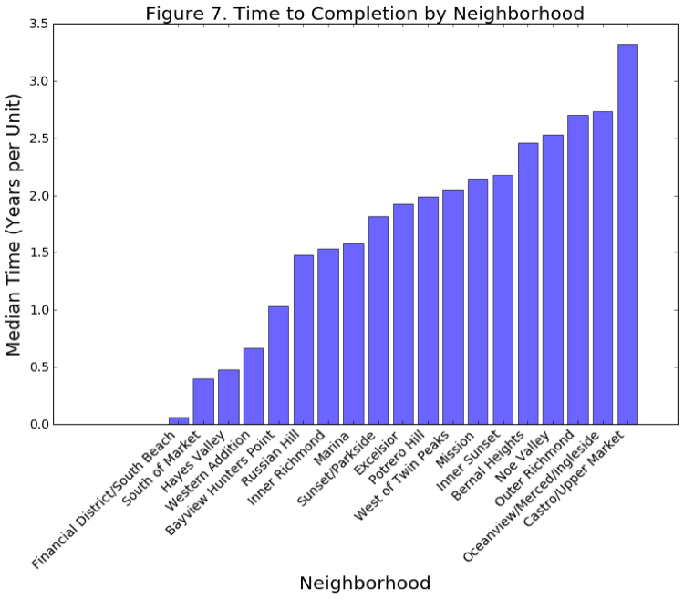
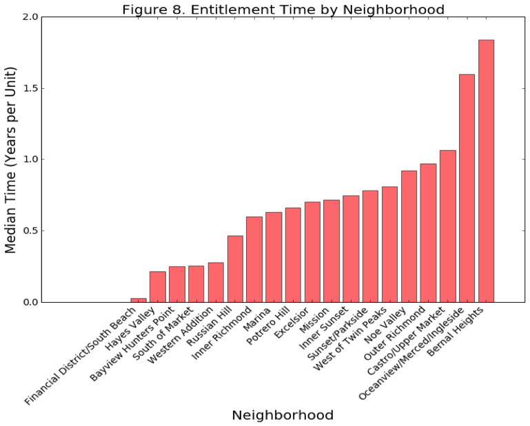
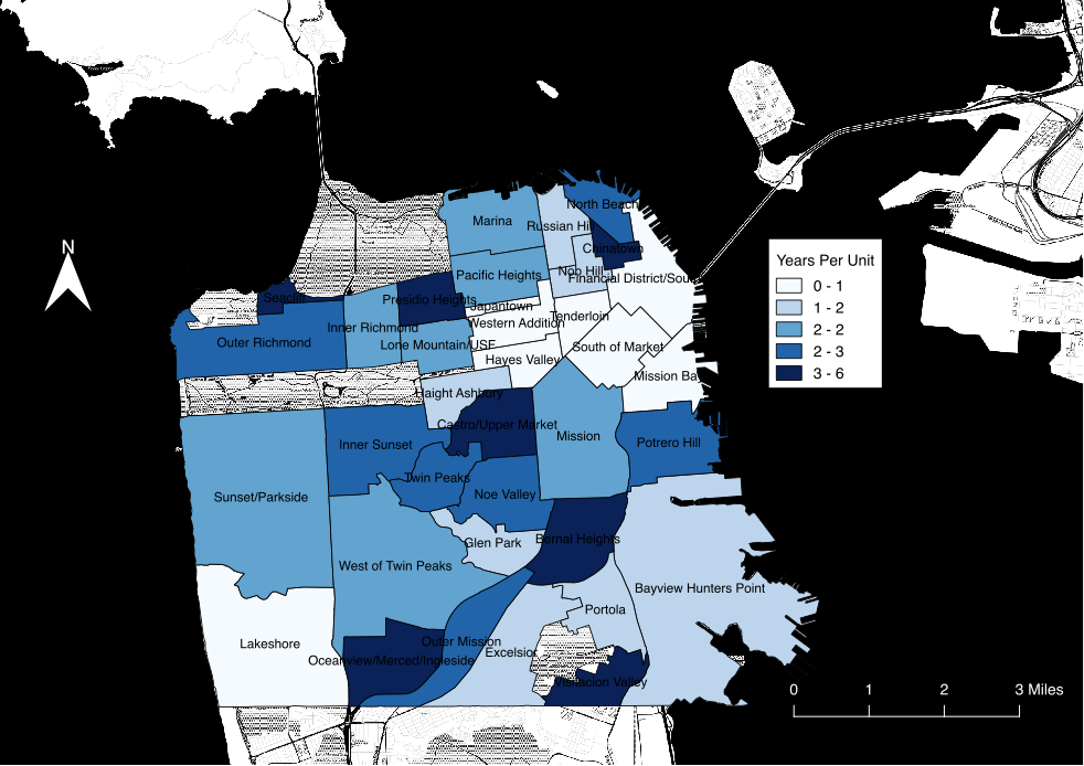
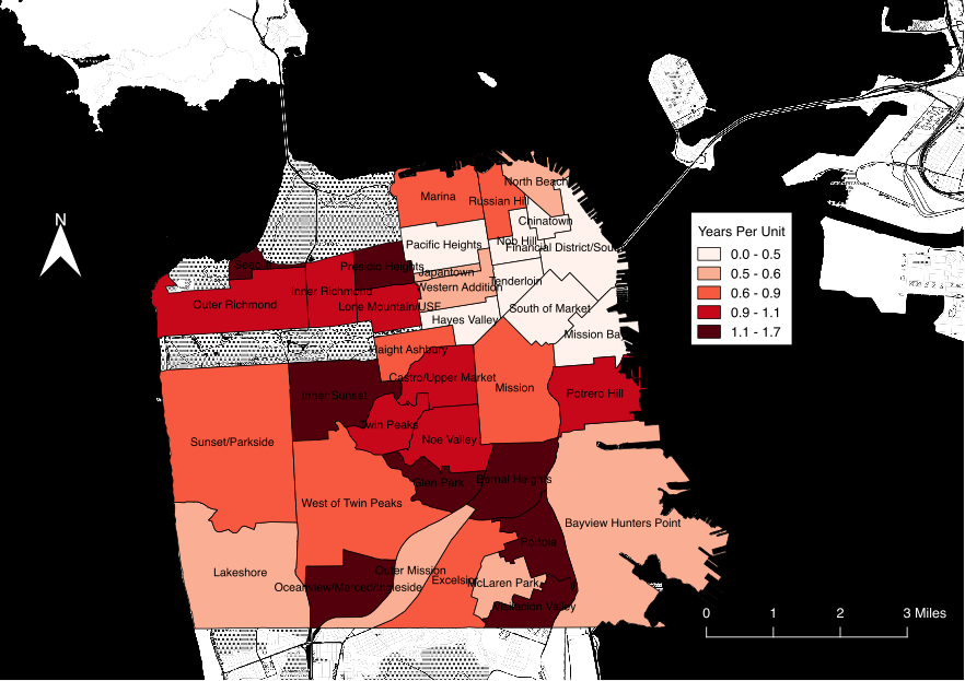
Finally, I explore differences between neighborhoods. For Figures 7 and 8 below, I use the 41 neighborhoods created by the Planning Department. Because some neighborhoods only get small housing developments while others only get very large developments, I normalize time to completion by dividing by units added. For these graphs, I also drop neighborhoods that have less than 10 developments in the sample. The results point to a clear pattern: when we divide time to completion by unit size, lower-density neighborhoods—such as Twin Peaks, Bernal Heights, or the Richmond District—outside of the core of the city have both larger total time to completion and entitlement review times. Conversely, most of the highest-density neighborhoods—places that have also seen the most development, such as Soma, Mission Bay, or Hayes Valley—have the shortest review times. Figures 9 and 10 show these results on the map.

These results emphasize an important point: despite much smaller development in outlying neighborhoods, the city spends just as much time reviewing developments in those areas. However, these developments have much less impact on the surrounding environment, and so likely do not merit commensurate review time as large apartment buildings near downtown. These results suggest that the city could have a large impact on housing streamlining by reducing the scrutiny on small to mid-sized developments. This would also likely conserve limited city resources.

Figure 9. Housing Time to Completion by Neighborhood

Figure 10. Housing Entitlement Time by Neighborhood

IV. Conclusion

I hope that this exercise has shown the potential benefit for local governments to collect data on the housing development process. Unfortunately, cities rarely maintain data on housing production at all, let alone the time it takes to create housing. In this example, we have learned not only how long developments take on average, but also how size and location impact review times. Armed with this knowledge, the data suggests some key areas of improvement in the housing review process.

First, both the longest stage of the housing development process and the stage with the most variation is the entitlement review process. This variation suggests that it has the most potential for delay or expedition of developments. Considering this, Mayor Ed Lee’s executive directive to streamline housing review definitely appears to target the correct part of the housing development process. Second, despite being smaller, mid-sized developments in low-density areas appear to have just as long development review times as larger apartment buildings. This signals that the development review process is at least somewhat misaligned, as the city could be saving time reviewing these projects and instead allocating this time to larger, more disruptive projects. Furthermore, this misallocation of priorities likely has a large impact on housing affordability, as mid-sized developments are likely to be more affordable than large apartment buildings, which are more costly and so demand top market rents.

Unfortunately, I cannot say from this analysis exactly why mid-sized developments have the such long review times. However, many of these projects are in low-density areas that are either 1) subject to more neighborhood resistance or 2) are not within specific plan areas, which qualify for streamlined environmental review. Unfortunately, the Mayor’s process streamlining directive does neither of these things, instead focusing speeding up internal procedures without reducing requirements. Disgruntled community members can appeal and delay projects no matter how hardworking and efficient the review process is. Instead, a more politically difficult but effective policy requires reducing regulatory requirements themselves, such as the amount of discretionary review for small projects. For example, the city could consider creating more specific area plans in outlying neighborhoods so that small projects in these areas would be subject to much less environmental review.


Quarter 1 2017 Development Pipeline Release

Time for another update to the San Francisco development pipeline database! After the release of the quarter 1 2017 data earlier this year, we can now visualize the projects completed in the last quarter of 2016. I have linked to the map below and here is a link to the full map on its own. The map allows users to filter to see projects completed in the latest quarter (Q4 2016).

As I have described in earlier posts, this is not a perfect exercise. This data is not really meant to be longitudinal, but I have stitched together multiple cross-sectional releases anyway. I make the assumption that a project is completed the quarter before it stops appearing in the pipeline reports. According to the reports here, this means that the project received its Certificate of Final Completion from the Department of Building Inspection. Most of the time, this seems like an accurate assumption.

Highlights of this release include:


All this adds up to nearly a thousand units added in the eastern half of the city in the final quarter of last year. Happy browsing!

Reflections on the MacArthur Transit Village

The MacArthur Transit Village was prominent in Oakland housing news in the first few months of this year. For those who don’t know, the MacArthur Transit Village is a large multifamily development between the City of Oakland, BART, for-profit and non-profit affordable housing developers on the former site of a parking lot next to the MacArthur BART station. The plans are big: 875 new units (including 146 affordable) with tens of thousands of square feet of non-residential ground-floor space. In general, it’s great news!

I thought now—a few months after the developer received final entitlements—would be a good time to reflect on some of what I learned from the development process. As part of a research methods course in the Masters of City Planning program, a few of my classmates and I wrote a paper about the project, which you can find here.

1. There’s a surprising amount of community support for housing in Oakland

I tend to consider people like me—pro-development urbanist nerds that celebrate density—an outlier. However, that’s not what I saw at the city meetings for the MacArthur Transit Village. If anything, two-thirds of the crowd was supportive of the project and cited the kinds of arguments—from the environmental benefits of transit-oriented housing to the need to increase housing supply at all ends of the market and increased property tax revenue, etc.— that you would hear in a city planning program. The supporters groups were a spectrum ranging from YIMBY activist groups (props to East Bay Forward), labor union members, to longtime area residents. Although these groups certainly have their differences, they each coalesced in support of the project for good reasons. Contrary to what I thought before the meetings, it isn’t just urbanist twitter arguing for smart, transit-oriented infill housing.

A few of my classmates and I wanted to survey neighborhood residents outside of the active community members present at the city meetings. In order to do this, we intercepted approximately 150 community members at intersections around the MacArthur BART station. Although this was in no way a random sampling of neighborhood residents, I think we learned some interesting things. For those who had heard of the project (about half), we asked if they supported or opposed the development. 24 supported the project, while 18 opposed. This sort of evidence, combined with the support I heard at the city meetings, gives me hope for future coalition building around a pro-development housing agenda. YIMBYs certainly leave out some important nuance from the discussion, and the views of other left-leaning housing activists and neighborhood residents could greatly contribute to a fuller, more formidable housing alliance—something that Jordan Fraade and Daniel Kay Hertz have discussed recently.

2. There is a disconnect between community needs and developer exactions

Our surveys showed that there was an apparent disconnect between what residents rated as the greatest community concerns and the exactions that the city is demanding from the transit village developers. As the table below shows, the community seems to clearly identify affordable housing availability as the greatest community problem. However, in the development agreement the city is demanding contributions for parks and other miscellaneous capital improvement projects in exchange for a density bonus. These are improvements that could instead likely come from the general tax revenue additions from the project. Instead, the city could use exactions in the development agreement as contributions to the city’s affordable housing fund or to more below-market rate units in the area. The exactions are not a lot, but every little bit helps. This is something that the city is struggling with in aggregate as well, and Oakland as a whole might be well suited to focusing developer exactions on subsidizing below market rate units.

3. Differences in project awareness is a possible culprit for this disconnect

Another interesting finding from our survey were differences in project awareness among age and housing tenure, shown in the figures below. Also, as Figure 7 below shows, residents who were familiar with the project were far more likely to have heard of the project via informal community associations rather than the city itself. In general, it seems like older homeowners were more likely to be aware of the project, and these residents were most likely to hear about the project from their neighbors or the news rather than the city itself.

Prior to the city’s meetings to decide the fate of the transit village, the only community outreach was in voluntary community meetings hosted by the developer or the local city councilor. Older homeowners tend to be the residents with the most social capital to hear about these meetings and thus, are best positioned to influence the negotiation process with the developer. While this is of course speculation, I’d bet that this same group would be more likely to support expenditures on parks, streets, and other miscellaneous amenities rather than affordable housing. Instead, a more comprehensive neighborhood survey would likely have given a better sense of the true neighborhood priority—housing. While I don’t know the practical solution to this problem, there’s a lesson here for planners about how we reach out to neighborhood groups. In particular, there’s definitely a place for more objective information gathering about neighborhood needs.

Q3-2016 SF Development Data Is Out

A little late on this, but the SF Planning Department released the latest release of its Development Pipeline series sometime over the winter holidays.

I have created a nice map of the residential developments from this data here. When filtering the data, the “All Proposed” data will show the Q3-2016 data. In sum, this is the latest snapshot of development activity happening in the city.

In addition to including all proposed developments, users can filter the data by 7 categories based on the latest status of the project: Under construction, building permit issued, building permit reinstated, building permit approved, building permit filed, planning department application filed, and planning department application filed. In general, the development process proceeds as follows: Planning department approval –> building permit approval –> Construction.

The current snapshot represents roughly what we have seen in the past: a relatively high amount of development in the eastern half of the city, especially around the Market Street corridor. By contrast, the western half of the city has little to no consequential development, aside from the Parkmerced megaproject.

Some logistical notes:

Also included in the map are developments from previous releases that have been completed. Developments leave the pipeline when they are granted a final “certificate of completion” from the Department of Building Inspection. While, in most cases this pinpoints the quarter of completion, it is not a perfect method.

Happy browsing!

Mapping Residential Development in San Francisco

San Francisco’s housing crisis is no secret. As perhaps the biggest city planning issue in the Bay Area, activists from all over the region—neighborhood organizations, planning professionals, NIMBYs, and YIMBYs—have fiercely debated and fought over new housing, development by development. Yet for all of the concerns and passion surrounding the issue, it is surprisingly difficult to find data on where, when, and by how much housing is being produced within the city.

In this long-form post, I try to bring this information to life from the data annals of the SF Planning Department. To preview what’s below, I explore patterns of housing production within San Francisco—where, and by how much has housing increased in the past few years? Next, I combine this data with neighborhood rent patterns from Zillow to explore how this production might relate to housing affordability.

Context

San Francisco has been producing tens of thousands of new jobs while typically only adding between two to four thousand new housing units each year (Moretti 2013). By the laws of supply and demand, this has naturally led to a shortage of affordable housing. This is not just a problem that affects the poor. Some economists have estimated that if metropolitan areas increased housing supply with outside worker demand, U.S. GDP could by as much as 9.7% (Chang-Tai and Moretti 2015).

Governments recognize that this is an issue. As part of the state-mandated Regional Housing Need Allocation (RHNA) process, the Association of Bay Area Governments (ABAG) has targeted San Francisco to provide 28,869 additional units of housing between 2014 and 2022 (ABAG 2014, p. 24). As we will see shortly with the maps of recent production in the past 3 ½ years, current production is roughly on track to achieve this goal. At the beginning of 2014, San Francisco had an estimated 379,597 units, so meeting the RHNA goals would represent about an 8% increase in housing (SFPD 2015, p. 5).

The Development Process

Note that the RHNA goals are not binding. Instead, this just means that San Francisco has to plan to accommodate this much housing by providing favorable zoning and funding to support these goals. Ultimately, meeting housing demand is up to the market. Although the development process is endlessly complex, I will spare my readers the gory details in exchange for some key points to understand the maps below.

There are two parallel permitting tracks: building permitting and planning permitting (entitlement). While the former ensures that a building meets building standards, the latter makes sure that it conforms to the land use zoning regulations. After construction, the Departments of Building Inspection looks over the development one more time and issues a Certificate of Final Completion, which is when I mark developments as completed in the maps below. With all this red tape, the median time from submission of first proposals to completion is typically 3 ½ years (“SFPD 2014, p. 15).

All this is to say that there is no getting around the zoning code. If there is any hope for a variance, developers usually need the support of the community, which typically decries any project out of scale with the ‘character’ of nearby development (Dineen 2016). These facts, combined with the map below of the zoning code, foreshadow a result that we can see in the interactive maps: highly concentrated development in the few places that it is allowed.


Figure 1. – SF Zoning Code 2014
SF Zoning Code 2014.
Notes: This map is a simplified version of the SF zoning code 2014. It shows that the majority of zones in San Francisco are low-density residential (in yellow). By contrast, only a small portion of the city allows for high-density mixed-use development (orange or brown). Source: SF Development Pipeline Report Q3 2014.

Map of Residential Projects

 The interactive map below allows users to click on the dots to see more details about each development. I have also linked the data with the Google Maps Javascript API for street view panoramas. Hopefully this can give users a sense of the neighborhood for each development. Furthermore, the map allows users to switch between recently completed projects and currently proposed projects. The map for recently completed projects shows residential completions in San Francisco from the SF Planning Department’s Development Pipeline Data. This data tracks residential completions between Q4 2012 – Q1 2016 (the only period for which there is consecutive data). The first thing that stands out to me is that the total number of projects seem fairly spread out. Despite this, it is clear that large recent developments have been concentrated in certain areas. In particular, the Market Street Corridor, SoMa, and the Dogpatch appear to have particularly high levels of development.

As for currently proposed developments, these appear to be a bit more dispersed but with the same general trends. Note that there are more dots for the currently proposed data because this includes all projects currently in the development pipeline, no matter how long the time horizon. This data includes all projects that currently have applications on file with either the planning department or the Department of Building Inspection and so they span from planning permits that have just recently been filed to construction. Furthermore, this map assumes that all projects will be brought to completion, which overstates what will actually be built. However, this map is probably a realistic prediction of what future development will look like on average.

Map by Neighborhood

The dot maps suggest that large residential development are concentrated, but in order to get a better sense of this concentration, I have aggregated units built with a polygon map. Because I will shortly examine development’s impact on neighborhood affordability, I use neighborhood boundaries from Zillow for this aggregation.

While not totally unexpected, it is startling to see how concentrated development is. Out of the 13,950 net units added over this time period, about half of these come from one neighborhood: SoMa. Furthermore, the top five neighborhoods—SoMa, the Financial District, Downton, the Western Addition, and Bayview—comprise 11,933 net units, or 86% of that total. By contrast, large areas in the western part of the city, such as Richmond or the Sunset District, have added less than 50 units each.

Although the housing supply is growing with demand, not every area of the city is sharing this burden. It’s important to point out that this is due to deliberate zoning decisions made by the planning department in the past 10 years. However, behind every planning decision is tremendous political pressure from neighborhood associations and the like. We can probably trace this development back to NIMBYism.

Impacts on Neighborhood Affordability

As an example of a research question that can use this data, I have merged the map data with Zillow’s neighborhood-level median rent index.[1] Has increased housing supply helped stem rising rents in neighborhoods with a large amount of residential development? Or could it actually have led to increasing rents? Contrary to basic microeconomic theory, some claim that increased development at a local level can actually increase rents due to positive externalities from property value improvements.

First, I examine data on recent units built between Q4 2012 and Q1 2016 and rent change over that same period in histograms. The first histogram reveals the truly extreme nature of the outliers. First, the figure shows that the overwhelming majority of neighborhoods added less than 200 or so units. Second, there is a small middle group that added between 500 and about 2000 units. Finally, there is SoMa in a class of its own.


Figure 2. – SF Units Added by Neighborhood
hist2
Notes: Figure shows amount of neighborhoods by number of units added over the span of Q4 2012 to Q1 2016

The second histogram shows that despite the high concentration of development, rent change is fairly evenly distributed across the neighborhoods. In good news for proponents of economic theory, two of the 5 neighborhoods with the lowest percentage increase in median rent—SoMA and the Western Addition—were also in the top 5 in units produced. However, the other 3—the Twin Peaks, North Beach, and Parkside—all added less than 100 units.


Figure 3. – SF Neighborhood Rent Change
hist1
Notes: Figure shows amount of neighborhoods by percentage rent change over the span of Q4 2012 to Q1 2016

To get a more complete sense of how increasing units in the market impacted rent change, I estimate the correlation between net units built and percentage change in rent. In particular, I estimate a line of best fit between these two variables with the ordinary least squares method. The figure below shows this line. The line does have a negative slope, indicating that for every 1000 units produced prevents rent increasing by about 3-5 percentage points. However, it is difficult to trust the negative slope of the line. The result is heavily influenced by one outlier, SoMa, which can be seen in the lower right-hand corner of the plot. The r-squared of the estimate—or the measure of how much of the variance in rent change is explained by units built—is only -.06. This indicates that only approximately 6% of the change in rent can be explained by the amount of units produced. In sum, there does not appear to be any clear relationship between rent change and units produced.


Figure 4. – Rent Change Versus Units Added
reg1

Lastly, I examine the relationship between average rent over the period Q4 2012 and Q1 2016 and net units produced. Perhaps wealthy neighborhoods with high property values restrict development through political influences on the zoning process and we can reveal this through correlations. In this case, the lint of best fit is also negatively sloped, indicating that a 1000 units increase in housing is associated with approximately 130 dollars less average rent. However, like the previous figure, it is difficult to give much weight to this result. The dots show that they are essentially uncorrelated with one another. In this instance the r squared is only -.026, indicating that about 3% of the variation in average rent can be explained by the amount of units built.


Figure 5. – Average Rent Versus Units Added
reg2

Yet, the fact that there is essentially no correlation in these two graphs is a result in itself. Although housing production has a clear impact on regional housing prices, the local impacts of increased supply are less clear. Getting to the bottom of this question requires data for a longer period, a more fine-grained geographic unit, and a complicated econometric model. There is no clear narrative one way or another, and that’s part of the reason that housing debates are so contentious.

Why Should Planners Care?

America’s cities are, for the most part, rapidly growing. In particularly high-demand areas like the Bay Area, this rapid growth is leading to rapid growing pains. With this development comes the need to build, but local zoning laws often confine the areas where that growth can happen. In fact, as we have seen above, the vast majority of growth can be concentrated in a very small portion of the city. This places a disproportionate share of the burdens of growth—crowded new developments, increased traffic, and tall new buildings—in certain neighborhoods.

It is no accident that neighborhoods like the Mission have been the poster child for gentrification in San Francisco. Yes, young professionals are attracted to the neighborhood because of its attractions, but the Mission is also one of the only places where new development is allowed. It’s time to shift some of the blame from gentrifying millennials to local planning decisions.

Furthermore, rapidly growing neighborhoods may not receive the benefits of increased housing supply with rent decreases. Although regions are clearly better of with increased housing supply on the whole, this makes little difference if the local benefits of development are ambiguous. Control over land use is local, and if cities don’t feel the benefits on the neighborhood-level, then urban areas will have a difficult time accommodating population growth with increased housing. Of course, we’ve already seen this with NIMBYs all across the U.S.

Moving Forward

I’m a firm believer that the first step in solving any issue is information gathering and sharing. That’s what I intend to do with this project and this blog moving forward. For tracking San Francisco development, I have set up a list of issues and future goals on the project’s github repository here. Items on the agenda include increasing user interactivity, increasing the time frame, exploring how current development relates to the existing housing stock, and, ultimately, gathering this data for other cities.

The housing debate starts with an honest, open dialogue and such a dialogue necessitates comprehensive and easy-to-access information. I hope that this project is a first step toward achieving that goal. Interactive maps of housing production might be useful not just for planners and developers, but also for neighborhood associations or residents interested in the broader context of regional housing development.

References

“2014 San Francsico Housing Inventory.” 2015. San Francisco Planning Department. http://www.sf-planning.org/ftp/files/publications_reports/2014_Housing_Inventory.pdf.

Chang-Tai, Hsieh, and Enrico Moretti. 2015. “Why Do Cities Matter? Local Growth and Aggregate Growth.” NBER Working Paper, no. No. 21154 (May). http://www.nber.org/papers/w21154.

Dineen, J. K. 2016. “In a Wealthy SF Neighborhood, Residents Fight Low-Income Housing.” San Francisco Chronicle. November 16. http://www.sfchronicle.com/bayarea/article/In-a-wealthy-SF-neighborhood-residents-fight-10617213.php.

Moretti, Enrico. 2013. “How to Make SF Housing More Affordable.” SFGate. http://www.sfgate.com/opinion/openforum/article/How-to-make-SF-housing-more-affordable-4590271.php.

“Regional Housing Need Plan: San Francisco Bay Area 2014-2022.” 2014. Association of Bay Area Governments. http://abag.ca.gov/files/ABAG_Final_RHNA_Publication.pdf.

“San Francisco Pipeline Report: Quarter 3 2014.” 2014. San Francsico Planning Department.

[1] In particular, I use the Zillow Rent Index (ZRI) Multifamily, SFR, Condo/Co-op time series found here.